
B E H I N D T H E A R T series #1:
These posts are part of a series that will talk about various aspects of my art and design work.
Artists Against Apartheid poster (1987)
I designed this poster for an Artists Against Apartheid benefit in 1987. Apartheid was a system began in 1948 of legal racial segregation enforced by the ruling white minority government in South Africa over the countries black majority.
The printing budget only allowed for two colours (black and green). I wanted to show what apartheid meant in one image by combining two images solidified by one colour. To me it wasn’t enough to just show a defiant demonstrator. I needed to show the origins of what this woman was defying. The viciousness of the police was what maintained this regime. Her country’s suffering was intrinsically linked to that brutality. So I placed the woman’s figure on top of a photo of charging police with riot shields. I then cut away her shirt revealing the image of the police. But because both photos were printing black, they had no visual depth. But by having my second colour (green) print everywhere on the poster except the contours of the woman and her original shirt, I was able to maintain her in the foreground but also have the police in the foreground and the background at the same time. To me, this was a visual metaphor for the overwhelming oppressiveness of the apartheid regime on the individual.
Oh… and in the end, the concert raised enough money to buy an ambulance that would be used specifically to aid those injured while protesting the apartheid regime. In 1991, the legal apparatus of apartheid was abolished and in 1994, South Africa’s first democratic elections were held.

B E H I N D T H E A R T series #2:
Behind the Bars illustration (2005)
Sometimes you just never know where your artwork will end up.
I drew this simple illustration in 2005 for the book Reproduce and Revolt! A Graphic Toolbox for the 21st Century Activist. The book was not published by Soft Skull until 2008. Everything takes longer than you think it will. Editors Josh MacPhee and Favianna Rodriguez did a great job putting the book together.
I got the idea for the pen and ink illustration from reading statistics about prison populations in the world. The United States has less than 5% of the world’s population. But it has almost 25% of the world’s prisoners. The U.S. has 2.3 million prisoners, more than any other nation in the world, according to the International Center for Prison Studies at King’s College in London.
China, which is four times more populous than the United States, is a distant second, with 1.6 million people in prison. The only other major industrialized nation that even comes close is Russia, with 627 prisoners for every 100,000 people. Studies have also shown that the level and duration of prison sentences do not correspond with a drop in the crime rate.
So, four years after making the drawing, I see the online magazine On The Issues (a feminist publication of critical, independent thinking) based in Long Island City, NY used it to illustrate an article called “End Torture, End Domestic Violence” by Rhonda Copelon. The article asks the question: how would the world be different for women if domestic violence were treated as torture or as cruel, inhuman or degrading treatment? The magazine used the book Reproduce and Revolt! in the way it was intended, as a resource for art. How perfect are the travels of a drawing.
Reproduce and Revolt! is available from: www.justseeds.org; http://www.softskull.com
B E H I N D T H E A R T series #3:
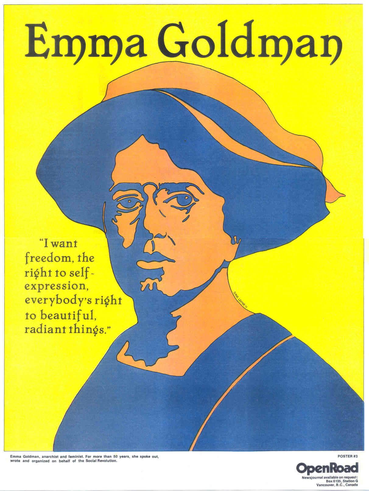
Emma Goldman poster (1977)
Emma Goldman, an anarchist and feminist, became the first poster I ever made, back in 1977. It was for Open Road, an international anarchist newspaper published out of Vancouver. I decided that rather than portray Emma Goldman as she actually looked physically in a realistic manner, I would instead portray the vibrancy of her life and the ideals she fought for. So with this in mind I used bright, bold colours blocked out on the poster, held together with a thin black line and elegant lettering for text. So in this way, the politics is inherent in the design rather than just in the content. This is something to keep in mind when your looking at or making art. The poster was later published by a feminist group in Germany. I am currently working on my second graphic novel, it is about the last year in the life of Emma Goldman, who died in Canada in 1940.
 B E H I N D T H E A R T series #4:
Ronald Reagan in El Salvador poster (1981).
In the 1980s, U.S. President Reagan’s support for the right wing regime in El Salvador led to human rights abuses. Amnesty International reported that the El Salvadoran security forces torture of civilians included beatings, sexual abuse, use of chemicals to disorient, mock executions, and the burning of flesh with sulphuric acid. It is estimated that government forces perpetrated between 12,000 and 25,000 murders. I thought that a black and white B-movie style poster was the best way to comment on the ex-actor’s rampage in Central America. Design inspiration came from having discovered the photo-montage work of John Heartfield. Letraset was used for the large text.
 B E H I N D T H E A R T series #5:
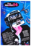
The Number 14 poster (1992)
The Number 14 was a socio-comedy theatre play about the people who board a bus as it travels from one side of the city to the other crossing through economically diverse neighbourhoods. It was a big hit and travelled the world, getting rave reviews including the New York Times. Produced by Axis Theatre Company and Touchstone Theatre. It continues to be produced over 20 years later. I took my inspiration from montage and hand-lettered most of the text.
 B E H I N D T H E A R T series #6:
Victims of Benevolence book cover (1995)
A book cover for “Victims of Benevolence: The Dark Legacy of the Williams Lake Residential School” (Arsenal Pulp Press) by Elizabeth Furniss. The book’s focal points are the death of a runaway boy and the suicide of another while they were students at the Williams Lake Indian Residential School which highlights the horrible history between the government, the church, and Aboriginal communities. In order to illustrate the sinister relationship between the church and students I made a rough photo-copy of a nun and students at the school and using a brush and paint I tinted the photo via overlays.
 B E H I N D T H E A R T series #7:
True (North) Strong & Free album cover (1987)
“True (North) Strong & Free” (Profile Records) a 12- inch album cover for D.O.A. This was probably the most complex paste-up I ever did. It involved around 20 overlays. I used a combination of spray-paint, crayon, and photo montage. One problem with the band’s name is that it’s hard to centre it on any layout because of the period after the D (it always looks off centre). So in this design I slanted their name and sliced off part of the last period in order to be able to centre D.O.A. The album included the band’s cover of the BTO song Takin’ Care of Business. A CD version of the album came out using my design but for some strange reason the record company changed the song title “Nazi Training Camp” to “Nasty Training Camp”. It’s actually odd that D.O.A. was even on Profile Records as it was a record label that specialized in urban-oriented music such as hip hop. The label ceased operations in 1996.
 B E H I N D T H E A R T series #8:
Unusual Circumstances/Interesting Times book cover (1991)
Unusual Circumstances/Interesting Times: And Other Impolite Interventions (New Star Books) by Brian Fawcett. For the cover I made a photo montage using colour photo copies and hand-painted black and white photo copies. An excellent but obscure book of essays on culture and politics. The author signed my copy: “Great cover, probably stronger than the book.” Brian Fawcett also wrote the masterpiece Cambodia: A Book For People Who Find Television Too Slow.
 B E H I N D T H E A R T series #9:
Super 8: Moving Image as Art poster (1988)
The “Super 8: Moving Image as Art” poster was for a festival of experimental films from Berlin, Toronto, Montreal and Vancouver at the Unit Pitt International Galleries. In order to keep the printing cost of the poster down I used just two colours. To create depth and the illusion of a third colour I used an adhesive dot screen called Letratone to create a 20% tint of the purple. I recall the image was from an ad in a 1950s magazine about feminine hygiene. Mecca Normal had put out our first 7″ the previous year on K Records and a film for one of the songs “Strong White Male” was in the festival so I thought it appropriate to include some of Jean’s lyrics on the image.
 B E H I N D T H E A R T series #10:
Firehall Dance Festival poster (1992)
This was a brochure for the Firehall Arts Centre’s annual dance festival in 1992. A very complex design that is meant to capture a sense of movement using text, photos, and colour. Because the budget was tight, I kept the cost of shooting the negatives to just 5 overlays (one for each CMYK colour, and one knock out for the white text).
B E H I N D T H E A R T series #11:
“Expo Hurts Everyone” 7″ EP (1986)
 I designed the cover and label art for “Expo Hurts Everyone”, a 7″ EP to protest the Expo 86 World’s Fair held in Vancouver (May 2 – October 13, 1986). For the cover I made a montage of creepy Social Credit Premier Bill Bennett, and Olaf Solhiem, the old miner who threw himself out of his single-occupancy room in Vancouver’s Downtown Eastside when he heard that he would be evicted to make way for tourists. My brother Ken Lester wrote the liner notes and assembled the bands: D.O.A. contributed “Billy and the Socreds” (a cover of CCR’s “Willy and the Poor Boys”); Stu Leal Band did “The Old Mangled Man”; Rhythm Activism did “Tyrannosaurus Wrexpo”, and my own duo Mecca Normal did “Sha La La La La”. D.O.A. went on to do a benefit show in Stanley Park with Pete Seeger and Arlo Guthrie protesting the Expo evictions, which raised $10,000.

I attended this event and I am pretty sure I have a surviving poster!